|
|
|
Home > Technology > Concept types
All our courses have been
transferred to Knowledge Management International University
|
|
 |
|
In a concept map or semantic network,
knowledge representation is accomplished by relations (with
their
relation types), concept types, and the overall map
connectivity. In
Knowledge Master,
concept types are categories, conceptual categories; categorization is one of
the main principles of cognitive psychology. Understanding is difficult
without categorization.
|
|
|
|
|
While the relation type
renders explicit what is the relation between two concepts, the
concept
type renders explicit the specific role a specific concept
(or a concept set) has in the conceptual context, in topic represented in the
map.
The concept type
explains, for instance, that a concept belongs to a certain general
taxonomy o physical, social o philosophical function.
In learning environments (from school up to higher
levels), it is preferred to enunciate this aspect as a concept
attribute, related to the role of
the concept in the topic represented in the map.
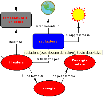
For instance, in a map
about the Earth, the concepts “Moon”
and “Sun”
could be of the “aster” type, or
else could respectively belong to the "star"
and "satellite" types.
This attribute is a knowledge
bearer and has a strong incidence in student perception, logically
and visually as well.
In this optic,
the same concept might have different concept
type attributes in different
maps, depending on the role of the concept in the specific map.
For
instance, in a map about the universe, the "Sun"
could be of the “star”
type, while in a maps about heat, it could be of the “heat
source” type.
These are decisions of the map author, as
well as defining or not the concept types.
Certainly, using concept types acquires
greater
importance when a concept type qualifies several concepts in the same map.
|
|
|
|
|
When the student analyses the
map, autonomously or guided by the instructor or the teacher, the concept
type or, even better, that the concept belongs to a type or a conceptual
category contributes decisively to precise representation, to stimulate
student attention and the map perceptive power,
enabling thus a greater satisfaction of cognitive needs.
An accurate presentation from the visual point of view reinforces perception
and motivation, enhances visualization that,
on its time, improves and reinforces short term
memory.
The concept type,
beside logical characterization (that enhances understanding), may
have a specific graphical aspect,
in symbol shape and colors, that represents it uniquely.
|
|
| |
|
|
The rational use of color and shape
(When color and shape have sense and contribute to the perception of meaning)
The possibility of representing concepts
and data roles differentiation in the map also visually, is
another important feature of using concept types, because it has a direct incidence
on student, empowering understanding and their associative capacity, speeding up
and facilitating new concepts integration.
Characterizing concept type graphical aspect
eases memorization, association and discovering and constitutes
a visual suggestion to the categorization
of
the represented concepts, a cognitive induction.
When analyzing or observing the map,
the students perceive a graphical aspect regularity of
a specific concept set (even if not necessarily in the same map neighborhood),
they instantly attribute these concepts a logical
regularity, associate them, understanding that it is a category.
Learning these regularities through
perception is immediate, has also a subliminal value, because it lies
very near to the conscious perception threshold, uses stimuli and
augments motivation.
Using geometrical shapes and colors uniformly flattens the map,
while using shapes and colors selected at random or "by definition", or
to draw attention to the "important" concepts, is not necessarily
knowledge representation, and might even reduce learning possibilities.
One of the
more important aspects of visual projection is the attention to color
harmony, to avoid the risk of monotony or
overstimulation.
|
|
|
|
The
correct use of color, geometries and symbol sizes in concept maps
Longing for an interesting, attractive, exciting and non monotonous presentation
to students, sometimes we prepare colorful maps, with geometrical symbols
selected at random or with arbitrary sizes.
Sometimes, instead,
we adapt map objects to long phrases, also lacking conceptual meaning.
Assigning arbitrary graphical attributes
map concepts (or to
the “important” concept) withdraws part of the map logical
value, that might become misleading, or create perplexity in
students, reducing the effect of presentation, and inhibiting fluidity
and efficacy in studying. It results in a topic representation
distortion and our efforts become worthless.
In every explanation or presentation
the student expects, consciously or unconsciously, a certain logic and much
coherence, that are, however, important aspects of any educational presentation.
How to explain irregularity when this becomes
lacking regularity?
We know that concept types have a logical and
cognitive value. They first exist as categories, and then may have
graphical attributes, from which we can visually infer that the concept
belongs to a type or category, and that it is the category to dress up with
graphical attributes, to be immediately and easily perceivable.
This is also the more simple and elegant mode to improve esthetical
aspects, integrating them in the map, also involving cognitive elements
of the map itself: the concept type is defined once (with two or
three clicks), ad afterwards its graphical attributes can be repeatedly
modified. At any change, all concepts belonging to that type assume
immediately the same graphical configuration, that remains always modifiable.
When a map is used in a lesson or presentation to students (present or distant) concept may be also referred to explicitly through its type (e.g.: “lake type”, “operations property”, etc.), and suddenly the students understand that all concepts with the same graphical dressing belong to the same category, and thus have the same role in the conceptual context, “in the map” in the topic they are studying.
|
|
|
|
Important aspects in the selection of geometrical symbols and colors
Geometrical symbols and colors are used in
specific ways by different methodologies, standards, norms, schools of
thought, and specialized diagrams.
Standardized diagrams and those specialized (flow, cause-effect,
etc.) use geometrical symbols in a canonical mode: they always have the
same proper meaning, and the user perceives them with that meaning, even
when when it doesn't relate to the current knowledge representation.
Symbols
and symbol families are a language and, in every
language, every symbol has its own specific meaning: the student will
instinctively attribute to every symbol the value he/she is used to.
If, as it usually happens, the student knows flow diagrams,
will understand that a rhombus represents a question, that a trapeze
means input/output, etc., and that will somehow change the cognitive message
goal.
The ellipse is the default symbol used for concepts
and informational units in most knowledge representation software, and
even since maps and networks were drawn on paper.
Beside the ellipse, the more liberally used symbols (because of
their generality, anonymity and text capacity) are the rectangle and
the square. Other symbols, as the rectangle with curved sides, are
used successfully for the same reason.
Beauty and harmony
are important aspects of a map to share or to
present to others; these goals are reached with the careful use of regularities,
colors, symmetries and harmonies, and placing concepts and
relations, rather than with colors or with the arbitrary adaptation of graphical
resources to long texts or casual colors.
When, watching or analyzing the map,
the student perceives a regularity in the graphical
dressing of a specific concept set (even if not necessarily placed
in the same map neighborhood), instantly and intuitively attributes these
concepts a logical regularity, associates
them, understand that it is a category.
Learning these regularities through
perception is immediate, has even a subliminal value, because it lie
very near to the conscious perception threshold, used stimuli and
augments motivation.
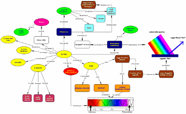
This image evidences the use of different shapes and colors association to graphically represents concept types.
In Knowledge Master, even when the concept (or informational unit) is
represented with an image, the concept type, - if assigned - remains.
Using uniformly geometrical shapes and colors
flattens the map, while using colors selected at random, or just defined, or to
attract student attention to "important concepts", is not necessarily
knowledge representation, and might even reduce map power.
|
|
| |
|
|
Color selection
When defining the concept
type graphical aspect, several colors can be associated to
several symbol elements:
 |
the bottom of the geometrical symbol (ellipse, rectangle, etc.); |
|
|
the characters; |
|
|
the symbol border. |
Assigning colors to each of these elements
is a map author's choice.
The selection should mainly reach a pleasant
association, the contrast between background and foreground, legibility
and an easy differentiation of concept types.
A table of contrasting and complementary (very contrasting) colors, is found
in the page related to
colors
(click the link to access the page).
Character
face is also variable, and it is possible to select between bold,
italics, underlined, or any combination
of these faces.
The innovative use of color
families stimulates and augments student perception.
It is important to remember that these presentation and marking resources,
that constitute a logical-visual strategy, are more useful to
differentiate concept categories than to accentuate the importance of the single
concepts. The importance of a concept is cognitive,
and is conferred by its associations in the map.
An adequate use of logic (pure
and simple) and of graphical aspect in defense of cognition to stimulate understanding
and motivation. A deeper insight of visual learning.
|
|
|
|
|
|
![]() |
| |
|